OVERVIEW
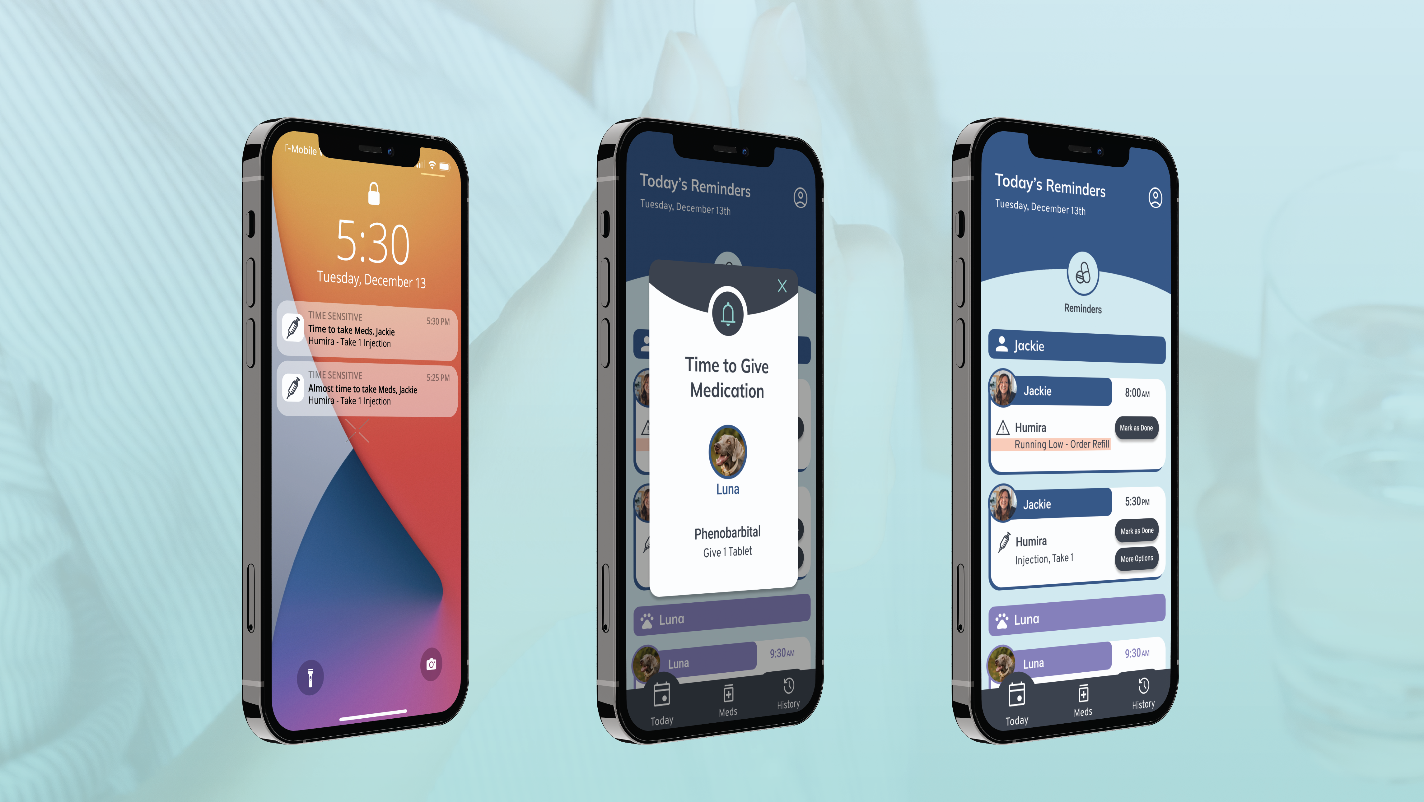
Pills Promptly is a fictional organization I created during my Google UX Design certification course. It aims to educate users about their medications.
My Roles
UX Researcher, Concept Developer, UX/UI Designer
Timeline
4 Weeks
PROBLEM
Medication regimens frequently change and it can be difficult for users to stay on top of their new directions and best practices. Users would benefit from an interface that educates them about their medication and verifies that the over-the-counter meds they use are safe when taken with other meds.
SOLUTION & IMPACT
I created a responsive website to educate users about their medication. It allows users to discover interactions between medications and ensures the information is patient-focused, organized, and easily digestible. It took all users under 15 seconds to check interactions between medications.
PROCESS
I conducted 5 in-person interviews, as well as, sent a Google survey to 15 additional participants to get to know about their pain points when taking or being prescribed new medication.
User Concerns About Medication
"How it can make you feel"
"Sometimes my medications make me lose my appetite, which makes me tired later in the day."
"Side effects, mostly not knowing how my body will react."
Personas
User Journey
I mapped out the journey users would take to complete the task of checking interactions between medications.
Information Architecture
I listed and organized the pages into a sitemap.
Paper Wireframes
Using the progressive enhancement strategy, I created multiple iterations for each page of the mobile website to focus on the most important elements first, then worked my way to tablet and desktop wireframes.
Digital Wireframes
Low-Fidelity Prototype: Desktop - Link to prototype
Usability Study Insights - Round 1
- Users need a new layout that allows them to see more text on the page at a time
- Users need a more simplified layout in order to process the information clearly
- Users need a clearer visual cue on how to approach the task of checking interactions
Usability Study Insights - Round 2
The redesign addressed the participants' concerns that the website looked too zoomed in and that it was difficult to see changes on the same page.
The task of finding interactions between medications caused confusion. It wasn't clear that you could add multiple medications and felt like an "add" button was missing.
The updated design has a focal point on the left column since that is where the interaction begins. The medications aren't numbered anymore so users know they can add multiple, and the "add" button tells them what will happen when they click it.
High-Fidelity Prototype - Link to prototype
TAKEAWAYS
I learned that it's common for organizations to have apps and websites for different use cases. I hadn't known or thought about that before. The idea for an alternate use case can come from user interviews during the research phase. When I did interviews for the pairing app, the second thing almost every participant mentioned was not knowing about certain medications and how they affect you.


