OVERVIEW
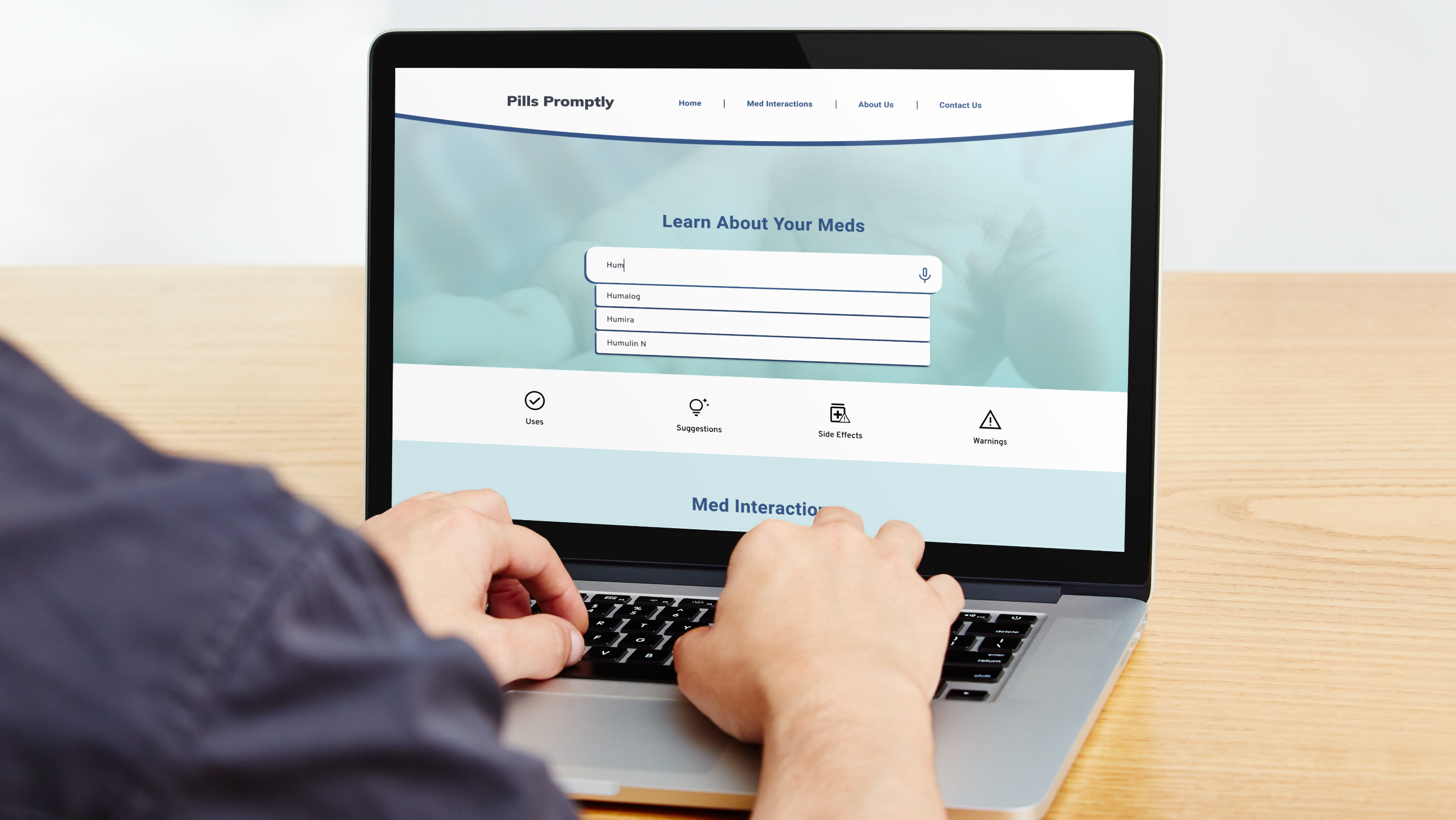
Pills Promptly is a fictional organization I created during my Google UX Design certification course. It aims to educate users about their medication.
My Role:
UX Researcher, Concept Developer, UX/UI Designer
Timeline
4 Weeks
PROBLEM
With more than half of people not taking their medication because they can't remember to, they forgot to fill their prescription, etc., there was a need for a tool to help users keep track of their medication and help them stay healthy.
SOLUTION & IMPACT
I created an app to help users manage medication for themselves and others (humans and pets). It includes a feature to track the quantity left so users can refill prescriptions before running out. I also took several measures to ensure users managing multiple medications give the correct one such as color coding profiles, icons that represent a human or pet and type of medication, and labels for the icons. The task success rate was 80% based on the testing so I'm confident if this app was on the market, it'd be beneficial to users.
PROCESS
I conducted 5 in-person interviews, as well as, sent a Google survey to 15 additional participants to get to know about their experience taking medicine, their frustrations, their current methods to remind them to take it, and more.
Personas
User Journey
I brainstormed a journey that includes the steps a user should take to get reminders for medication and also how they might feel during each step and a potential solution for those feelings.
Information Architecture
The user journey helped inform the sitemap.
Paper Wireframes
I spent time sketching out different ways I could lay out each screen. I even used one of my favorite exercises, the "Crazy Eights" method.
Digital Wireframes
Low-Fidelity Prototype - Link to prototype
Please refer to Luna's prescription information below if needed during your interaction.
Usability Testing Insights - Round 1
- Users need better cues on what steps to take
- Users need options that better fit what their prescriptions look like
- Users need a clearer visual cue on how to approach the main task of adding medication reminders
Usability Testing Insights - Round 2
Most users thought they might miss reminders if they couldn't see all of them on the same screen and felt they needed more ways to differentiate between the profiles to avoid mistakes quickly.
The new design shows all profiles on the same screen, a color-coded section for each user, and the addition of a picture for each profile.
Users found that the original design was overwhelming, they couldn't figure out what to look at first, and every single participant wasn't sure what "today" was.
The updated design focuses on one day at a time, allows them to look through each day with a familiar horizontal scrolling bar, and "today's" date is shown at the top of the screen for easy reference.
High-Fidelity Prototype - Link to prototype
Please refer to Jackie and/or Luna's prescription information below during your interaction.
TAKEAWAYS
I learned how challenging it can be to design an app for an industry that you're not familiar with. Every drug is completely different so I consulted with pharmacy and nursing students to get as much info about the commonalities and differences between many types of medication in order to provide the best experience possible for all users.


